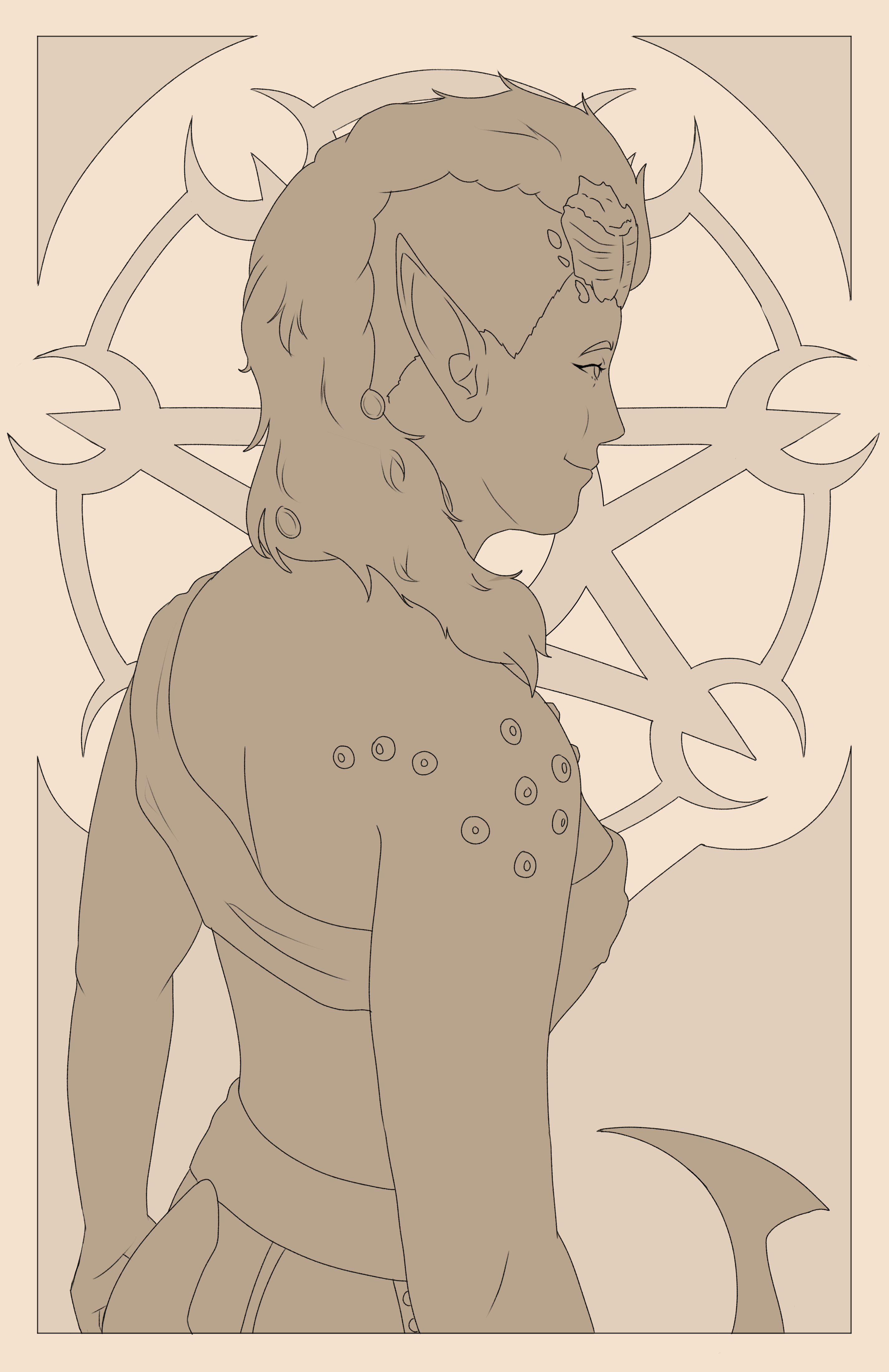
Art Nouveau Karlach
Work in progress for the next piece in my Art Nouveau Baldur's Gate series!!
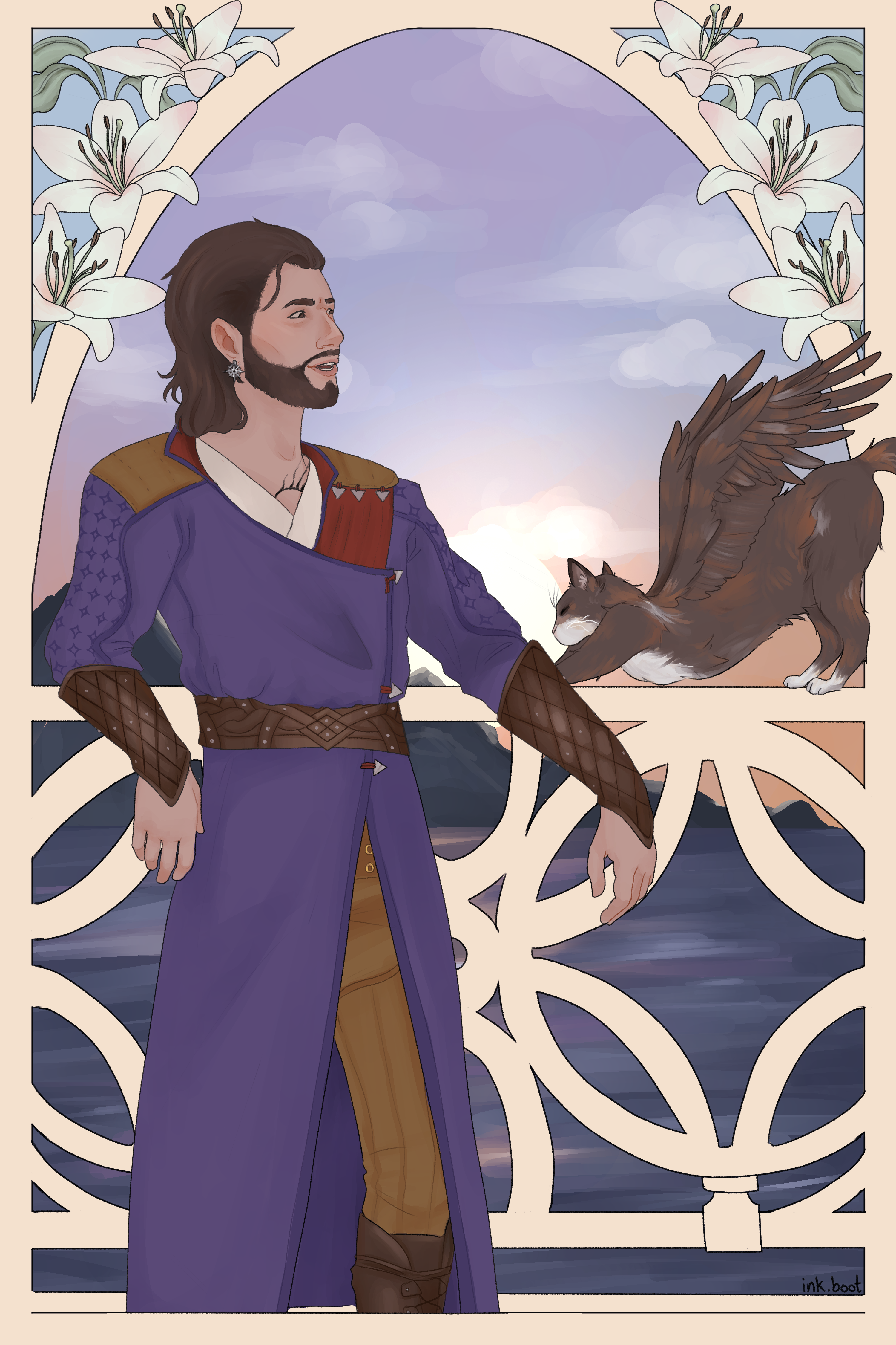
Art Nouveau Gale
Worked on this over the course of 6 days! It was my first time really photo-bashing for a reference, which looked a little silly but definitely helped me plan everything out, especially those damn feathers and pose for Tara. I had some trouble making sure it looked like him but I do think it turned out good! I'm really proud of this piece specifically because I'd been in SUCH bad art block, and I actually surprised myself with how much I liked this piece.
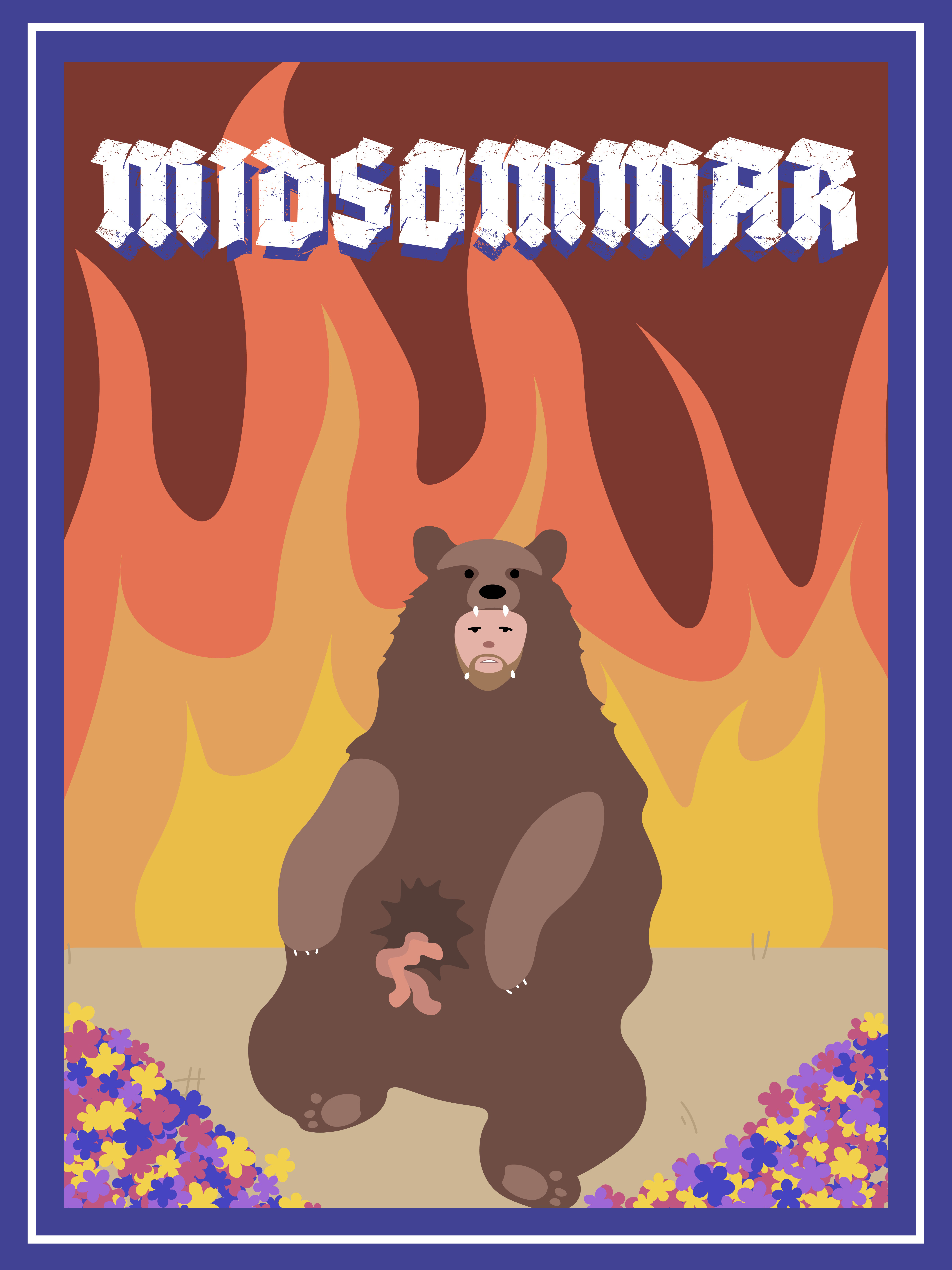
Midsommar Poster
Made this in high school when I finished all my other Adobe Illustrator work for class, and it's still one of my favorite posters I've made :) It's not very advanced, but I think that's what's so good about it, minimal but still captures the vibe of the Midsommar film.
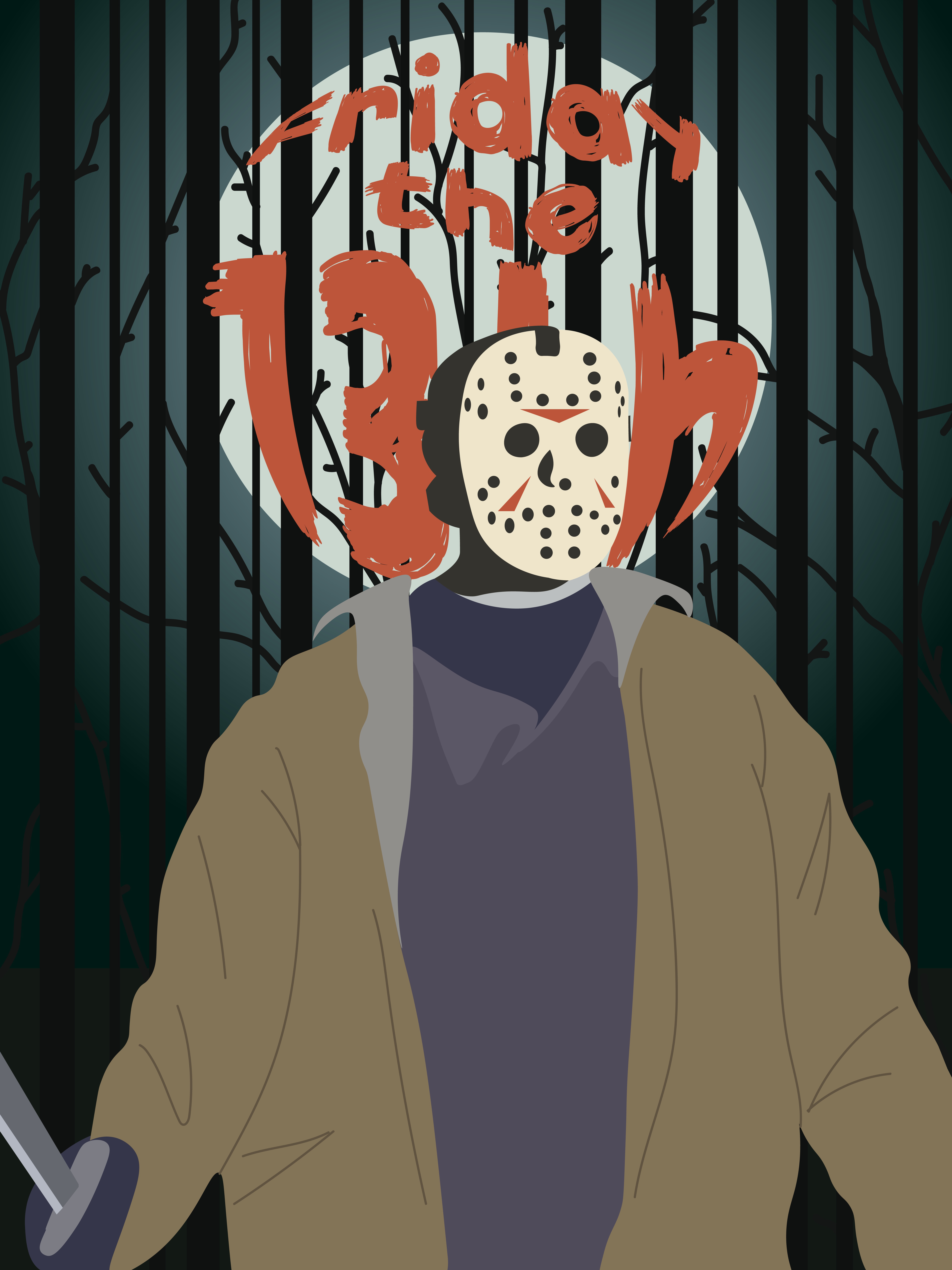
Friday the 13th Poster
Another poster from the same class as my Midsommar poster, I like this one a lot too but have been considering remaking it with my current skill, as it's about 2 and a half years old at this point. I made a bunch of horror movie posters during high school and didn't have any instruction on any of them, and as this was one of the first it holds a special place in my heart as how I learned to use Illustrator.
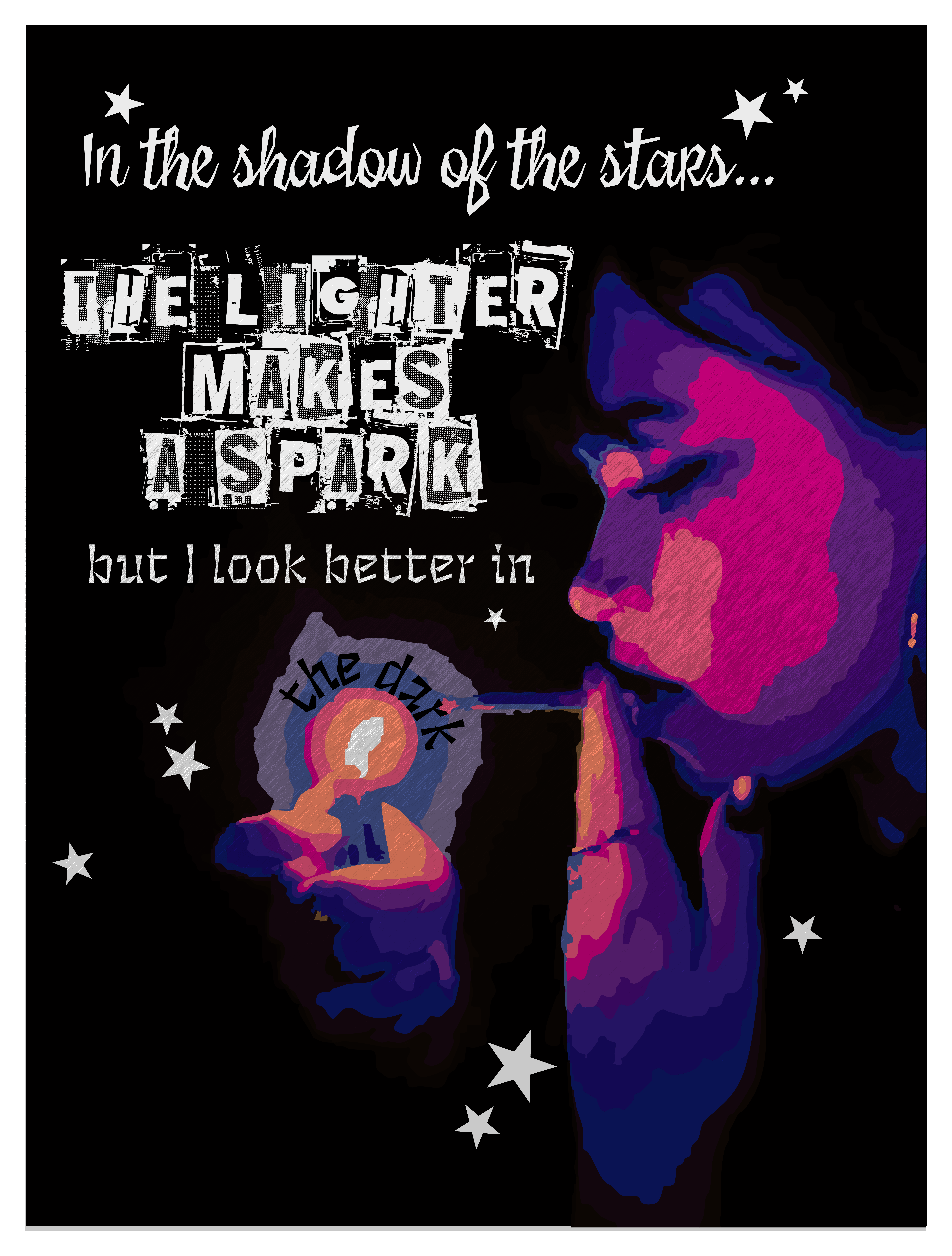
Practicing Design Styles
Had an assignment in one of my design classes to create a poster using any quote and a design style we discussed in class. I chose the "punk" style and made sure to feature "scrapbook" fonts and lots of contrast and textures, as well as lyrics from "Better in the Dark" by TV Girl and Jordana. I really like this poster and I personally think it's something I would put on my wall!
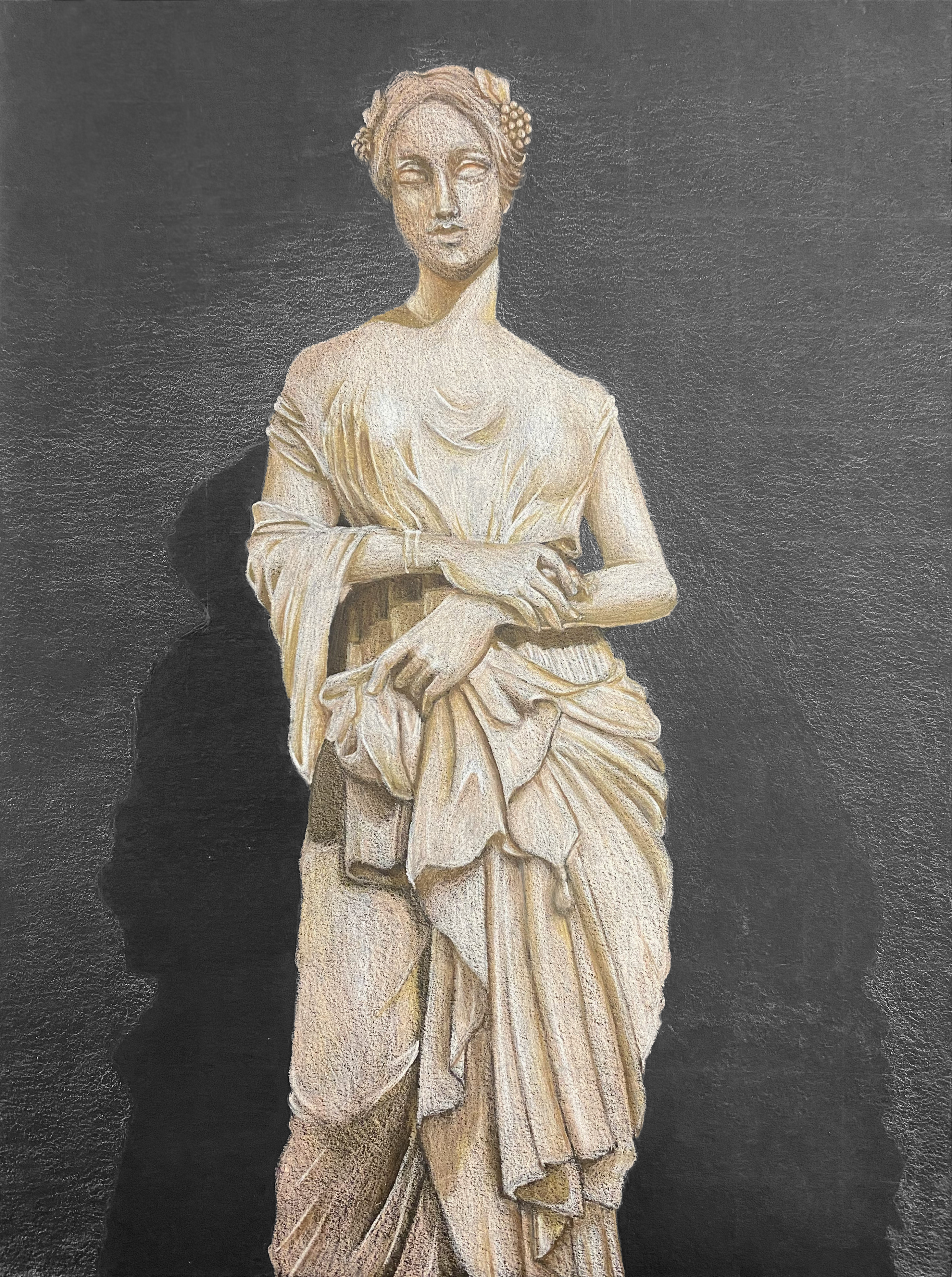
Colored Pencil Statue
This is from my senior year in high school! My teacher tasked me to do a piece on black paper with Prismacolor pencils, I chose a photo I had taken while I was at the Met in NYC to reference. I've never been particularly great at drawing clothing folds and creases so I knew it would be a challenge, but with the reference I knew it was doable. The face is actually probably my least favorite part here even though I usually feel the strongest in that aspect, I just feel like the folds were so fun to do and I love how they turned out. This is still one of my favorite things I did while in my high school art program, especially now that I'm out of practice with traditional art.